When creating a website with a tool such as WordPress, it's easy to get carried away using excessive plugins and widgets to enable all manner of bells & whistles, but it all slows down the loading of your site.
Less is more!
Unless there is added value to the user, don't be tempted to add more than is necessary. Don't use 3 paragraphs where 1 or 2 sentences will do the job. Don't get bogged down in excessive images unless they are required to get the message across. Everything you add to a page has to be downloaded by the requesting browser. Plus, some things you might add may also have lots of CSS, jQuery, and other assets too.
Teddington Tutor

This website is for an independent Tutor in Teddington. The home page makes it instantly obvious what this tutor can do for you or your child. One to one tuition for the subjects listed on the home page. There are links to find out more about each subject, and about the tutor. So if you want to find out more, you can. However, the home page is direct and to the point. It's simple, yet highly effective.
The home page does include a very large image, which is the biggest download of the page most likely, but it's appropriate and pleasing. It does add value to the message.
There's no carousel or slider, and there isn't excessive text. Google is likely to rank this page highly. In fact, if you search for a tutor in Teddington, it is the No.1 organic result. Not surprising really, is it?
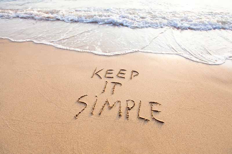
Keep It Simple
Our one and only message in this article is to urge you to keep it simple when creating your web pages. Think not only about your marketing, but about site visitors. Think about how to make it clear what your offering, and keep the pages as small as is required to get the message across. The more you add to the page, the more the user has to download.
That's it. Good luck!