Right, let's talk about something that used to drive me absolutely mental — getting typography to scale properly across different screen sizes. You'd set a font size, add a few media queries, and then discover your headings look ridiculous on a 27-inch iMac or completely unreadable on someone's phone. Brilliant.
The Clamp Generator from McNeece Web Design changes all that, and I mean properly changes it. No more guesswork, no more endless tweaking at 2am wondering why your H1 won't behave. Just clean, visual CSS that actually works.
Here's what we're covering (and trust me, by the end you'll wonder how you lived without this thing):
Table of contents
- Why fluid typography actually matters
- What the clamp function actually does
- Hands-on with the Clamp Generator
- Best-practice sizes and accessibility
- Workflow tips for actual designers
- Performance and SEO wins with proper hosting
- How this compares to other tools
- When NOT to use clamp
- FAQs
- Final thoughts

Why fluid typography actually matters
Look, I know "fluid typography" sounds like something someone made up at a web design conference after too many beers, but hear me out — it's genuinely useful.
The traditional approach? You'd pick a base size, then write media queries like you're building a wall brick by brick. Small screens get 14px. Tablets get 16px. Desktops get 18px. And God help you if someone's got a weird in-between screen size because your text is going to look proper weird.
Fluid typography scales smoothly with the viewport. No jumps, no awkward transitions, just text that feels right at every single screen width. It also helps with Core Web Vitals (which Google cares about), keeps line lengths readable (which humans care about), and means less CSS bloat (which your site speed cares about).
The Web Content Accessibility Guidelines specifically mention that users should be able to resize text up to 200% without breaking your layout. Fluid type makes that so much easier because you're working with browser behaviour rather than fighting against it.
"The clamp() CSS function clamps a value within a range of values between a defined minimum bound and a maximum bound." — MDN Web Docs
In practice, you're telling the browser: "Keep this between X and Y, but use this formula to scale smoothly in between." Dead simple once you wrap your head around it.
If you've ever worked in Elementor (and if you haven't, here's why we use it), Webflow, Bricks, or even raw HTML/CSS, you'll know how much time gets wasted on font sizing. This approach removes all that faff.
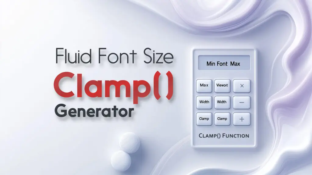
What the clamp function actually does
The clamp() function takes three values: minimum, preferred, and maximum. The browser picks the preferred value unless it would go below the min or above the max.
"To use clamp(), enter three values: a minimum value, an ideal value to calculate from, and a maximum value." — web.dev (Google)
For fluid typography, that "preferred" value is usually a formula mixing a base size with a viewport unit (like vw). So instead of writing five different media queries, you get one line of CSS that scales linearly.
Example time: clamp(1rem, 0.5rem + 2vw, 2rem) means "start at 1rem, scale up with the viewport, but never exceed 2rem." Brilliant.
And before you ask — yes, clamp() works for other things too (widths, margins, paddings), but today we're focused on font sizing because that's where most people struggle.

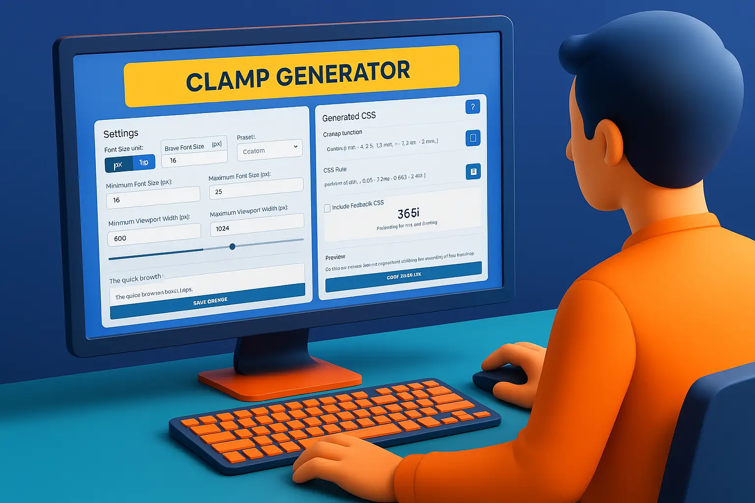
Hands-on with the Clamp Generator
The Clamp Generator interface is proper clean. No login walls, no "upgrade to see more features" nonsense, just four main sections: Settings, Generated CSS, Preview, and Suggested Font Sizes.
What you actually get
| Feature | What it does | Why it matters |
|---|---|---|
| Units toggle | Switch between px and rem (with custom base) | Matches however your project's set up |
| Min/Max sliders | Set your font size range visually | No manual maths — just drag and see |
| Viewport sliders | Define when scaling starts and stops | Control exactly where the magic happens |
| Presets | Save your favourite setups | Perfect if you're an agency managing multiple sites |
| Generated CSS | Copy the clamp() expression or full rule | Two clicks and you're done |
| Fallback CSS | Adds a static fallback for ancient browsers | Belt-and-braces approach |
| Shareable link | Creates a unique URL with your settings | Great for client approvals or tutorials |
| Live preview | Type your own text, adjust font family and weight | See changes instantly — no deploy needed |
| Suggested sizes | One-click examples for common use cases | Brilliant learning tool |
I've tested this on several WordPress sites and it just works. No drama, no weird rendering issues, just smooth scaling.
Example output that actually makes sense
Let's say you want body text between 16px and 28px, scaling from 600px to 1024px viewport width, with a base of 16px.
The Clamp Generator gives you:
font-size: clamp(1rem, -0.06rem + 2.83vw, 1.75rem);
That single line replaces at least three media queries. Copy it, paste it, done. If you've ever spent hours tweaking font sizes (and if you're a developer, you absolutely have), you'll appreciate how much time this saves.
Copy, save, and share like a pro
Two things I properly love about this tool:
- Copy buttons next to both the
clamp()value and the full CSS rule — no manual selection, no accidentally copying extra whitespace - Share URL that saves your entire setup — perfect when you're showing design options to a client or teaching someone how clamp works
There's also an existing guide if you want to dive deeper: The Ultimate Guide to Using the Font-size Clamp() Generator.

Best-practice sizes and accessibility
Let's talk numbers. For body text, respect the user's default (usually 16px) and scale headings proportionally. The Clamp Generator helps you visualise exactly how these behave across different screens.
| Element | Min size | Preferred | Max size | Notes |
|---|---|---|---|---|
| Body text | 16px | 0rem + 1.2vw | 18px | Keeps ~65 characters per line — the sweet spot for readability |
| H6 | 18px | -0.2rem + 1.8vw | 22px | Good for card titles and small subheads |
| H4 | 22px | -0.4rem + 2.4vw | 30px | Balanced for section headers |
| H2 | 28px | -0.6rem + 3.2vw | 40px | Mid-screen use, still readable on mobile |
| H1 | 36px | -0.8rem + 4vw | 56px | Hero heading that doesn't overwhelm smaller screens |
These are starting points, not gospel. Test them using the Clamp Generator's live preview and adjust based on your font family — some typefaces need more breathing room than others.
Accessibility bits that actually matter
- Use rem units when possible so text respects browser zoom. If someone needs 200% zoom (and many people do), rem-based sizing won't break your layout.
- Test at 200% zoom — seriously, do this. You'll catch overlapping elements and text that gets cut off.
- Line height matters — aim for around 1.5 for body text. Nothing to do with clamp, but while we're here: tight line height makes text hard to read, especially for anyone with dyslexia or visual impairments.
The Web Content Accessibility Guidelines (WCAG 2.1, Success Criterion 1.4.4) require text to be resizable up to 200% without loss of content or functionality. Fluid typography makes this so much easier because you're not fighting fixed pixel values at every breakpoint.
Workflow tips for actual designers
For Elementor users: Paste the generated CSS into the Custom CSS box of a widget or add it to your global stylesheet. Works a treat. (And if you're wondering why we're such big fans of Elementor, this post explains it all.)
For developers: Store your clamp values in CSS variables for maximum reusability:
:root {
  --fs-body: clamp(1rem, 0.2rem + 1vw, 1.125rem);
  --fs-h1: clamp(2.25rem, 1rem + 4vw, 3.5rem);
  --fs-h2: clamp(1.75rem, 0.8rem + 3vw, 2.5rem);
}

body { font-size: var(--fs-body); }
h1 { font-size: var(--fs-h1); }
h2 { font-size: var(--fs-h2); }
This keeps everything organised and makes global changes dead simple.
For design teams: Use the preset feature to maintain consistency across projects. Save your standard scale once, then reuse it everywhere. No more "what font size did we use on that last project?" messages in Slack.
Need client-facing documentation? Check out the AI FAQ Generator — brilliant for turning technical stuff into shareable explanations that non-technical clients can actually understand.

Performance and SEO wins with proper hosting
A smaller CSS footprint means faster page loads. Simple as that. When you replace multiple media queries with a single clamp() declaration, you're cutting bytes and reducing the complexity the browser has to parse.
This matters for WordPress performance and it matters for Core Web Vitals. Google's algorithm looks at Largest Contentful Paint (LCP), First Input Delay (FID), and Cumulative Layout Shift (CLS). Cleaner CSS helps with all three.
But here's where it gets properly interesting — pair optimised CSS with 365i's Global CDN, and you're looking at UK TTFB times around 20ms compared to 300ms without a CDN. The difference is mental.
The 365i CDN doesn't just cache your files; it automatically compresses and optimises HTML, CSS, JavaScript, and images. It converts images to WebP, minifies code on the fly, and serves everything from the edge location closest to your user. All included free with hosting.
If you're serious about site speed (and if Google rankings matter to you, you should be), WordPress Turbo Hosting adds even faster compute nodes plus pre-caching. Pages load instantly. Like, scary fast.
There's more on optimising WordPress speed in this guide: Ultimate Guide to Supercharging Your WordPress Website Speed in 2025.
How this compares to other tools
Other clamp calculators exist. Some are fine. But the Clamp Generator from McNeece Web Design stands out because:
- Clean, logical workflow — settings on the left, output in the middle, preview on the right. No hunting for buttons.
- Presets that actually make sense — not just "Example 1, Example 2" but proper starting points for common use cases.
- Zero friction — no sign-up, no email capture, no "unlock premium features." Just open, use, copy, done.
- Team-friendly — the shareable link feature is brilliant for collaboration.
If you've used 365i's Box Shadow Generator or CSS FAQ Accordion tool, the Clamp Generator feels like part of the same ecosystem — simple, visual, genuinely useful.
Some calculators give you the maths but don't show you what it looks like. Others show you a preview but make the settings confusing. The Clamp Generator nails both.
When NOT to use clamp (yes, there are times)
Fluid typography isn't always the answer. Here's when you might want to stick with fixed sizes or traditional media queries:
- Very short text snippets (like buttons or labels) where you need precise control
- Print stylesheets — clamp relies on viewport units which don't translate well to print
- Legacy browser support — if you're stuck supporting IE11 (my condolences), you'll need fallbacks
That said, for 99% of modern web projects, clamp is brilliant. And the Clamp Generator makes fallback CSS optional anyway, so you're covered.
FAQs
Do I need to know code to use the Clamp Generator?
Can I use clamp() for other CSS properties besides font size?
Does clamp() replace media queries entirely?
Is the Clamp Generator free to use?
How does clamp() affect accessibility?
What browsers support clamp()?
Can I save my clamp settings for reuse?
How does fluid typography help with SEO?
Learn more about our WordPress Hosting.

Final thoughts
The Clamp Generator is one of those tools that immediately improves your workflow. No learning curve, no complexity, just a straightforward way to create fluid typography that looks professional on every screen size.
Whether you're hand-coding CSS, working in Elementor, or building sites in Bricks or Oxygen, this saves time and removes the guesswork from responsive font sizing. It's clean, intuitive, and completely free.
If you care about performance (and you should — Google certainly does), responsive design, and accessibility, give the Clamp Generator a try. Then pair it with proper WordPress hosting that includes a free global CDN, and you've got a setup that's both beautiful and fast.
And that's what good web design should be — functional, accessible, and quick to load. No compromises needed.
Useful resources:
- Clamp Generator tool: https://www.mcneece.com/clamp-generator/
- WordPress Hosting: https://staging.365i.co.uk/wordpress-hosting/
- WordPress Turbo Hosting: https://staging.365i.co.uk/wordpress-turbo-hosting/
- Global CDN: https://staging.365i.co.uk/cdn/
- AI FAQ Generator: https://staging.365i.co.uk/ai-faq-generator/

