WordPress powers an incredible 43% of all websites on the internet. Almost half the digital world runs on this single platform, and with good reason too.
Creating websites has become available to everyone through WordPress. Personal sites can cost as little as £100. Yet becoming skilled at WordPress website design isn't as simple as choosing from 11,000+ free themes and considering it complete.
Your business's WordPress website needs a well-laid-out approach. This includes everything from setting clear goals to making strategic design choices. The best part? You won't need coding expertise to build something amazing. Modern features like block patterns and over 59,000 free plugins help you create professional sites without writing code.
Want to build a WordPress website that makes your business shine? We'll guide you through each step from planning to launch. You'll learn to sidestep common mistakes that new users make. Let's head over to the details!
Understanding WordPress Design Fundamentals
"Design is a funny word. Some people think design means how it looks. But of course, if you dig deeper, it's really how it works." — Steve Jobs, Co-founder and former CEO of Apple Inc.
Let's face it—anyone can put together a WordPress website, but building one that drives your business forward? That's where the real magic happens. The basic design principles of WordPress go beyond making things look good. They help create an experience that directs visitors right where you need them.
The anatomy of a well-designed WordPress website
Your WordPress website works like a digital storefront with different parts working together. The header sits at the top—it's your website's face with your logo, navigation menu, and sometimes a search bar or call-to-action button. A good header is a vital part of your layout that shows your brand and helps visitors find their way.
The navigation menu needs extra attention. It's more than just links—it's your site's roadmap. Your main menu should clearly show what's available and where to go. This stops visitors from getting lost and running back to Google.
The content area comes next—the heart of your website where visitors find what they need. The footer follows at the bottom, and it's more important than you'd think. You'll find extra navigation, contact details, and key information there without making the main page messy.
These elements come together to create your website's structure or architecture—how your pages connect and group together. This setup determines how visitors and search engines move through your site.
Key design principles that apply to WordPress
Good WordPress design relies on some basic principles. Visual hierarchy comes first—showing elements in a way that highlights what's most important. This guides your visitors' eyes to your key content.
White space is your best friend. This empty area gives your content room to breathe. Visitors won't feel overwhelmed, and each element stands out better. White space isn't wasted—it makes your site readable and easy to use.
Typography can make or break your site. Pick fonts that people can read easily. Use no more than 2-4 font types—maybe one for headers and another for body text—to keep things consistent.
Your design must work on all devices. Most people browse on phones now, so your WordPress site should look great on any screen size. If you're looking for the fastest possible WordPress experience, hosting choice matters—fast servers dramatically improve responsiveness across all devices.
Making your site available to everyone matters too. Good design means everyone can use your site, including people with disabilities. Add proper image descriptions, make sure people can use keyboards to navigate, and check your color contrasts.
Common WordPress design mistakes beginners make
New WordPress users often stumble along the way. The biggest problem? Theme-hopping—switching themes too often before finding the right one. This confuses visitors and wastes time rebuilding your site.
Many people also create messy navigation. Think of your website navigation like air quality—good navigation goes unnoticed, but bad navigation frustrates everyone.
Categories and tags often trip up beginners. Some sites have too many categories but no tags, while others stuff hundreds of tags with no categories. According to WPBeginner, categories should work like a table of contents, and tags like an index.
Poor content structure is another common issue. Without proper headlines (H1, H2, H3) and subheadings, your content becomes hard to read—and most people scan rather than read everything.
Many new users forget about speed. Fancy designs with lots of animations, sliders, and extra plugins might look cool but will slow down your site. This frustrates visitors and hurts your search rankings. For an in-depth look at boosting WordPress performance, check out our guide on optimizing your site with turbo hosting.
Understanding these basics helps you avoid common mistakes and sets up your design for success. Let's look at planning your WordPress website design strategy next.
Planning Your WordPress Website Design Strategy
Planning a WordPress website needs real strategy, unlike picking wallpaper for your living room. A solid plan sets professionals apart from amateurs, especially for sites that need to work harder than the average family pet.
Defining your website goals and target audience
Clear, measurable goals work like a roadmap that shows the direction of your WordPress design. You're basically driving blindfolded through a motorway without them. Your website goals should line up with your broader business objectives. This could mean increasing sales, building brand awareness, or growing an email list.
The first step is answering basic questions: What purpose will your site serve? Will it provide information? Generate leads? Sell products? Book services? These core objectives should guide everything else.
The SMART method—Specific, Measurable, Achievable, Relevant, and Time-Bound—helps make your goals stick. Don't just say "I want more traffic." Be specific: "I want to increase organic traffic by 25% within six months."
Next comes defining who you're building this site for. A target audience shares similar interests, needs, or characteristics that make them likely to connect with your content. Writing for everyone means you'll strike a chord with no one.
User personas help bring your target audience to life. These fictional characters use demographic information (age, location, gender), psychographic data (interests, values), goals, and pain points. They help you picture exactly who you're designing for, which makes decisions about layout, colors, and content easier by a lot.
If you're in Kettering or the surrounding areas and need support with this phase, our professional website design services can help you clarify your goals and target audience.
Creating a site structure that makes sense
Your site structure serves as the backbone of your entire WordPress website. It determines how your pages connect and group together. A well-laid-out site helps your audience find what they want. Poor structure sends visitors running back to Google faster than you can say "bounce rate."
Start by mapping out your site architecture visually. Put your homepage at the top, then connect other pages based on how users will direct through them. Good structure looks like a pyramid with several levels: homepage at the top, categories below, possibly subcategories for larger sites, and individual pages/posts at the bottom.
Only your most important, high-level pages belong in the main navigation menu. Think of it like air quality—nobody notices when it's good, but it becomes all anyone thinks about when it's bad.
Categories bring order to your content. They group blog posts or products by topic so visitors can explore based on their interests. Most sites work best with a hierarchical structure, letting users reach any page within three to four clicks.
For SEO optimization of your site structure, our guide on mastering WordPress SEO for faster indexing offers valuable insights beyond basic structure planning.
Gathering design inspiration from successful WordPress sites
Creative minds need inspiration too, so feel free to study what works. The WordPress Showcase features the best websites built with WordPress. It offers a goldmine of ideas for your own design.
Look at successful WordPress websites and get into their: design (visual appearance, color scheme, layout), usability (ease of navigation), responsiveness (how well they work on different devices), and speed. Notice how top brands use WordPress to show their style and identity while keeping things functional.
Pick three to five sites like what you imagine. Keep these as reference points throughout your design process. There's another reason to study your competitors' websites: you might spot gaps in the market that your site could fill.
It's worth mentioning that inspiration doesn't mean imitation. The point isn't to copy another site exactly. Instead, understand what makes great WordPress websites work, then blend those principles into your own unique design. For a real-world example of this process, check out our success story with McNeece Web Design.

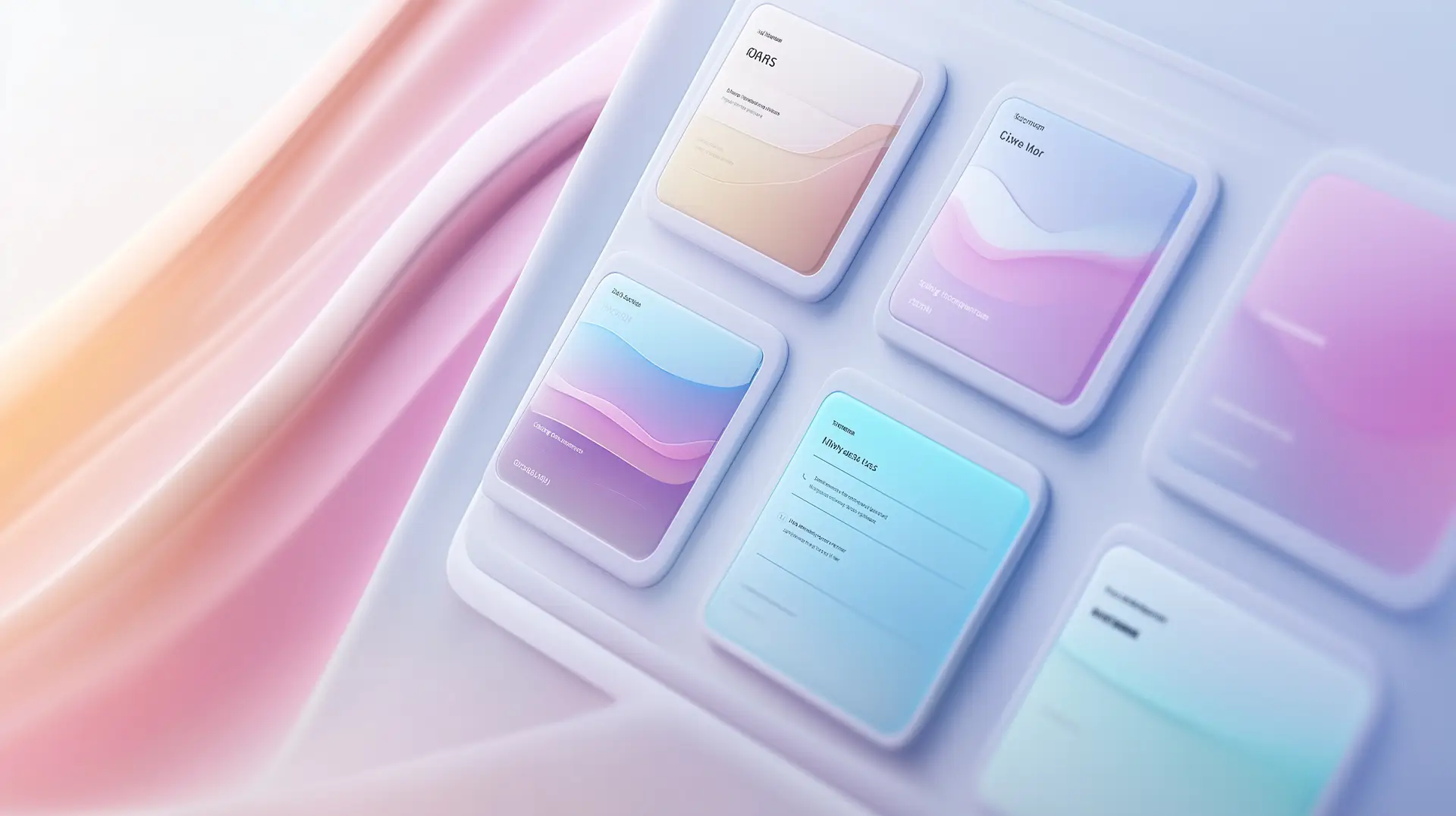
Building Your WordPress Website's Visual Identity
Visitors judge your WordPress website in less time than a British person takes to queue for tea. Your visual identity isn't just pretty window dressing—it's a silent salesperson that welcomes visitors or sends them running for the exit button.
Crafting a memorable header and navigation
Headers are without doubt the most significant design element—the first thing visitors notice when they arrive. A good header has your logo, navigation menu, and sometimes a search bar or call-to-action button. Think of it as your digital storefront's façade that needs to be functional and instantly recognizable.
Your logo should sit where visitors expect it (usually top left) and link back to your homepage. This matches what users look for when they navigate. The navigation menu needs special care since it's your site's gateway—keep it clean, logical, and focused on key pages. Your visitors can find what they need without feeling lost.
Designing footer sections that actually get noticed
In stark comparison to this, footers aren't dusty afterthoughts where copyright notices go to die. These valuable spaces complement your header by offering extra navigation options and important details without cluttering the main page.
Good footers have links to pages that don't fit in your main menu, contact details, and newsletter signup forms. Many businesses now add social proof elements like testimonials or trust badges too. To name just one example, SearchWP places a strong call-to-action button in their footer that targets users who've scrolled down and shown real interest in their offering.
Creating consistent page templates across your site
A consistent design isn't just visually appealing—it brings psychological comfort. Your visitors build trust when typography, color schemes, and layouts stay uniform throughout the site. This kind of consistency takes planning.
Start with reusable templates for different content types (blog posts, product pages, etc.) that keep your visual identity consistent everywhere on your website. These templates work as blueprints for content display and ensure your layouts stay coherent as your site grows. WordPress's template system or page builders help implement these templates, giving you a cohesive look without redesigning each page from scratch.
If you're a beginner, our WordPress website creation guide provides step-by-step instructions for setting up WordPress templates effectively.
Implementing User-Friendly Design Elements
The best WordPress sites don't just look amazing - they're a perfect blend of user-friendly design elements. Amateur sites might stumble around like a penguin on roller skates, but professional WordPress website design creates an experience so natural that visitors find what they need without thinking about it.
Navigation design that guides visitors where you want them to go
Navigation works as the silent conductor of your WordPress website's symphony. A well-laid-out menu serves as a roadmap that guides visitors through your content. You should keep it simple with 5-7 key menu items to avoid overwhelming visitors. Use descriptive labels instead of vague terms like "Services" or "Products."
Sticky navigation keeps the menu visible as users scroll, which helps visitors access important pages at any point during their trip. Breadcrumbs add a secondary navigation system that shows users their location within your site hierarchy—this works great for large sites with multiple content layers.
Hamburger menus keep navigation tidy for mobile users until needed. Your WordPress website stays clean while providing access to key pages. Make sure all menu elements are touch-friendly, with buttons large enough for fingers to tap without mistakes.
Call-to-action buttons that actually convert
Your site visitors should take specific actions—sign up for a newsletter, buy a product, or get involved with more content. A standout CTA points the way forward.
The best CTA should be:
- Visually striking with a contrasting color that pops
- Clear, action-oriented text
- Placed where it naturally draws the eye
- Designed as a natural next step
When creating CTAs, pick a white background with black text for buttons and set the border radius to 100 pixels for that eye-catching rounded effect. Button placement matters—right after or halfway through written content works well for today's users who want quick results.
Form design that doesn't scare users away
Bad forms make visitors leave quickly. Single-column forms convert better, though multi-column layouts work in specific cases. Wider columns suit smaller input fields like phone numbers, checkboxes, and dropdowns.
Longer forms work better when split into multiple pages with progress indicators that show completion status. Show inline validation messages that point out problems and help fix them. Example text in placeholder fields can substantially cut down user confusion.
For beautiful form implementations and other design elements, consider using our easy-to-use website builder that handles these details automatically.
Accessibility considerations for inclusive design
Accessibility isn't optional—it makes your WordPress web design work for everyone. A truly accessible website should work for people with auditory, cognitive, neurological, physical, speech, and visual disabilities.
Your design needs adequate color contrast (minimum 4.5:1 ratio for normal text) and more than just color to share information. The site should work with keyboard navigation and show clear focus states on links. Add alt text for images, captions for videos, and make sure any auto-playing content has visible controls to stop, pause, or hide the element.

Optimizing Your WordPress Design for Performance
Your WordPress website might look like the Sistine Chapel ceiling, but if it loads slower than a snail climbing Everest, visitors will run faster than politicians dodging accountability. Performance isn't just another technical checkbox—it's the foundation that holds up your beautiful design choices.
Speed optimization techniques that preserve design quality
Many people misunderstand the connection between design and performance. You don't need to sacrifice visual appeal for speed. Images are the first place to start—they usually weigh down your pages the most. Each image needs compression and optimization before upload.
Lazy loading becomes your secret weapon. This technique loads images only when they're about to enter the user's browser window and waits to load others until visitors scroll down. These speed improvements will also help:
- Minify CSS and JavaScript files by removing unnecessary characters like spaces and comments
- Enable caching to store static versions of your pages, reducing load times for returning visitors
- Limit the number of revision histories WordPress keeps for each post
- A Content Delivery Network (CDN) can distribute your content across multiple servers worldwide
Theme selection significantly affects performance. Simple themes with fewer flashy elements load faster naturally. Question each element you add—if you spend too much time thinking about it, you probably don't need it.
For serious speed optimization, check out our WordPress Turbo Hosting service that employs server-side optimizations to significantly reduce loading times. We also offer a free global CDN to further enhance your site's performance around the world.
Mobile-first design approaches for better rankings
Mobile optimization has evolved from an afterthought to become the life-blood of effective WordPress web design. Google now uses your content's mobile version as its primary source for indexing and ranking. This makes sense since over 90% of internet users browse through mobile devices as of 2023.
Mobile-first design reverses the traditional workflow. Designers start with the smallest screen and gradually enhance for larger displays. This strategy reduces bounce rates, boosts search rankings, and makes your content easy to read on small screens.
The difference between responsive and mobile-first design is vital. A mobile-first site will always be responsive, but responsive sites aren't always mobile-first. The key lies in your approach—building for mobile from scratch instead of scaling down desktop designs.
Your mobile-first WordPress design should have simple navigation menus (less is more), well-spaced content layout, and readable fonts. Testing your site on different devices and browsers helps catch problems before visitors do.
For a full strategy on future-proofing your website with these techniques, read our guide on web hosting in 2025.

Conclusion
Building a WordPress website isn't rocket science, but it needs more thought than picking your morning tea blend. A well-planned design and focus on performance will create a website that works harder than a British queue manager on Boxing Day.
Your WordPress design needs three key elements to shine. Solid fundamentals guide visitors naturally through your site. User-friendly features keep them interested, and optimized performance makes them stay long enough to see your content. Picture hosting the perfect dinner party - your site should look inviting, make guests feel at home, and serve up content faster than a proper Sunday roast.
The road to WordPress expertise might look scary at first. These techniques and insights will help you create something brilliant. Clear goals, solid structure, and thoughtful design elements make a difference. Your website should work as hard as you do - maybe even harder during your cheeky afternoon nap.
Your visitors' needs should drive every design choice. A beautiful website without purpose works like an umbrella in a hurricane. Create an experience that guides and converts your target audience the right way.
If you need assistance with any aspect of WordPress design or hosting, our human-focused support team is always ready to help with personalized solutions rather than generic advice.
FAQs
How long does it typically take to master WordPress website design?
The time to master WordPress design varies, but with dedicated practice and learning, most beginners can become proficient within a few months. Continuous learning and hands-on experience are key to improving your skills over time.
Do I need coding skills to create a professional WordPress website?
While coding knowledge can be beneficial, it's not strictly necessary to create a professional WordPress website. Many themes and page builders allow you to design attractive sites without coding. However, understanding basic HTML, CSS, and PHP can give you more flexibility and control.
What are some essential plugins for a WordPress website?
Some essential plugins include security plugins like Wordfence, SEO plugins such as Yoast SEO, caching plugins like WP Super Cache for performance, and backup plugins like UpdraftPlus. The specific plugins you need may vary depending on your website's purpose and functionality.
How can I ensure my WordPress website is mobile-friendly?
To ensure your WordPress website is mobile-friendly, use a responsive theme, implement a mobile-first design approach, optimize images for mobile devices, simplify navigation menus, and regularly test your site on various mobile devices and screen sizes.
What's the difference between WordPress.com and WordPress.org?
WordPress.com is a hosted platform where you can create a website quickly, but with limited customization options. WordPress.org is the self-hosted version that offers full control over your website, allowing for extensive customization and the use of any plugins or themes you choose. It requires more technical knowledge but provides greater flexibility.